Thomas in short
I’m a stylist, colorist and visual artist
based in Amsterdam, where I live in a 70m² apartment in the heart of the Red
Light District, surprisingly quiet, serene and full of colour. My background is
in fashion and branding, but my passion lies in building strong visual
identities. Whether that’s for people, editorials, spaces or brands. I’m also
part of the artist duo Rotteveel Vermeer, where we explore colour, form and
energy through abstract foil-based wall works. My home reflects everything I
value: colour as energy, minimalism with playfulness, and a deep sense of
harmony.
How would you describe your (interior) style?
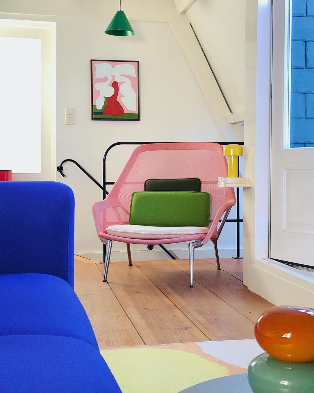
Intuitive minimalism with a strong focus on colour and form. Everything in my home is intentional. I don’t like visual noise. I work a lot with secondary or muted colours, clean lines, and design that balances function and emotion. There’s a subtle playfulness in how I mix objects, but everything still feels calm and cohesive.
What about colour in your home?
Colour is everything to me. It’s a language. I use it to create mood, energy and harmony. I often work with colours that are linked to natural materials: mint, terracotta, faded yellow, soft blues. It gives a grounded feeling. My dining area has food-related tones like egg-yolk yellow or lemon, because I like when colour supports the function of a space.
What is your favourite place in the house?
Probably the dining area. It’s where the energy is most alive. The chairs are Jean Prouvé in citron yellow, there's a sculptural lamp that looks like a floating egg, and I often sit there journaling or hosting friends. It’s a place where colour, form and function come together beautifully.
Is there one item specifically that you are attached to?
Yes, my artwork by Thomas Trum in vibrant red. It’s bold, geometric and feels like pure energy. It grounds the space and reminds me to stay close to what excites me visually.
Where do you get your furniture and accessories?
It’s a mix: some pieces are from brands like Muller van Severen, HAY, Montana, Tebton, Rira Objects, Kartell, Tylko or Vitra, some pieces are pre-loved. I choose carefully. I don’t like to collect things for the sake of it. Everything needs to earn its place by being either functional or emotionally resonant.
Dreaming about a future place to live (your dream house)... what does that dream look like?
Something even more stripped-back and minimal. Maybe a more spacious house in nature, where colour and form are completely in balance with their surroundings. Lots of light, clean surfaces, and room to think.
What's a real "no go" for your interior?
Clutter, and anything that doesn’t spark joy or serve a purpose. I’ve become very conscious of what I bring into my space. No impulsive purchases. Just calm, curated objects that work together.
Anything about your interior that you could really recommend?
Live with less, but make every piece count. Choose one great version of something. The perfect glass, the best cutting board, the best kitchen paper dispenser and let it elevate the everyday. And don’t be afraid of colour, just use it with intention.
You are part of artist duo Rotteveel Vermeer where you use a lot of colour as well.Can you tell us something about the material and technique you use?
We work with adhesive foil on aluminium, which we cut, fold and layer by hand. It’s a very physical, direct process. The foil plays with light and surface. In a way the material has many similarities with paint.
Our work is about exploring how colours interact and how their character shifts depending on the combinations or context. They’re colour studies in 3D, and pretty easy to transport, which makes them perfect for international exhibitions. In the picture you see our latest exhibition in Taiwan.
Use left/right arrows to navigate the slideshow or swipe left/right if using a mobile device